Wednesday, January 10, 2007

Three Olives Vodka

Objective

Back to the normalcy of vodka advertising Three Olives Vodka is another contender in the vodka industry. Fairly new to the scene, Three Olives Vodka attempts to compete with the other top shelf vodkas such as Grey Goose, Absolut Level, and Ketel One. Its advertisements are much the same as any alcohol—combining their product with sensual images of women in barely anything at all. Their creative standpoint comes from the oversized martini glass in which are the women. Their tagline reads: "What’s in your martini" encouraging the viewer to decide whether they’re using the premium vodka (Three Olives) like they should. This message also alludes to the women in the martini, metaphorically tying Three Olives Vodka to be a sensuous vodka, kind of sexy in a way.


Their ads are not too cluttered as with some alcohol ads, and the message is clear and concise. The effectiveness of the ad seems reasonable and the women pictured most obviously make these ads attention getters.

Subjective

While I like Three Olives’ ads, personally I’m attracted to those ads that are unique, creative, and don’t have the same old allure of sex with alcohol. To me it seems tedious. And while it may be effective, I’m waiting out for someone like Ketel One who takes that new, fresh approach to advertising, whose not afraid to be different. Overall, the ads are arousing and amusing, but other than that they leave me to question whether it is an effective route for Three Olives in their hopes of competing with the top shelf vodkas. Personally, these ads wouldn’t instill in me a desire to try Three Olives. Still, what alcohol ads really do cause the reader to want to try their product? (A question we’ll discuss at a later date once more companies have been reviewed).












Ketel One

Objective

Possibly the most distinctive ad campaign in the alcohol industry, and definitely in the vodka industry thus far, Ketel One represents simplicity to its core while undeniably attracting the reader's attention. Be it in Travel & Leisure or Vogue, no matter who the reader Ketel One has an attention grabbing style. A blank page with a simple message is how Ketel One chooses to promote its product. Seen below are a variety of these ads-all with their own unique message.


Always quirky and creative, the Ketel One's messages seem to compliment the Ketel One drinker while complimenting their product as well.


Even a non-Ketel One drinker would most likely be able to recognize even the font that their ads use--distinct and memorable. Ketel One chose a different path then most alcohol advertisements, rather then shower the viewer in senuous images, Ketel One chose a blank white page with a line of text--that's all. Never anything more, never anything less, Ketel One truly stands out on its own, something arguably above its competition. Ketel One boasts a smooth tasting vodka, with almost no taste at all, which attracts many drinkers (http://www.alcoholreviews.com/SPIRITS/polishvodkas2.html).

Subjective

While the ads are unique, Ketel One's approach doesn't impress me all that much. Sure, their ads are one of a kind, but they seem to be lacking the appropriate effort and ad should put forth. Though they do capture the readers' attention I question whether the message that they have is strong enough. It's disconcerting because I'm sure they have a great product, but some find their ads to be a bit pretentious and are turned off to the product. I have to say though I'm not sure what suggestions I would make to them, they do have such a recognizable style. Overall, I'm just content with these ads, not really pleased and blown away, but not ready to totally bash them. Undoubtedly in the future I will post about Ketel One again because of their prevalence in the alcohol advertising world, the examples given were only a few compared to the majority of other ads they have run.

Pictures from T&L Nov 2006 and Vogue Jan 2007 also found under Google Images

Thursday, January 04, 2007

Grey Goose

Objective

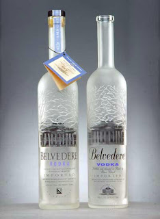
Keeping with the theme of vodkas another key player comes to mind: Grey Goose. Leading the way for top shelf vodkas, Grey Goose incorporates class and taste. With an elegant and simple frosted bottle, Grey Goose is luxurious subtly.


Running very few ads, Grey Goose is amazingly recognized by the distinguished vodka drinker. Keeping their ads simple and to the point, Grey Goose boasts it is the "Best Tasting Vodka in the World"


Not afraid of competition the Grey Goose ads also include a comprehensive list of the vodkas that placed below them. Following with the general clean layout of their ads Grey Goose also advertises: "The World's Best Tasting Drinks Start with Grey Goose" and "The World's Best Martini starts with Grey Goose"


Grey Goose's advertisements are uncomplicated and give a strong message.


Upon visiting their website one will find the same modest appearance, with simple links to the different parts of the page. Each click first starting with multimedia of the viewer seemingly backing out of a room that is filled with beautiful people. Unlike Belvedere, the people at the Grey Goose party are not overly elegant, but more realistic as if at a casual get together. One feature that is nice about the website is the link to 'Mixology' where the viewer can find different Grey Goose recipes.

Subjective


Incredibly Impressed with Grey Goose, I completely enjoy their ads. Only having a few adverts, Grey Goose's reputation is unbelievable. The name is so widely recognizable for only being around for a short time. In an article at inc.com (http://www.inc.com/magazine/20050901/qa.html) the creator of Grey Goose, Sidney Frank tells how he created the vodka mostly because vodka doesn't have a shelf time and it can be sold right away. His vision and execution of Grey Goose is an example for all entrepreneurs. The website is also incredibly striking, being fresh and clean, it gave me so many options that were beyond just the vodka. Able to find how to make drinks and even sponsorships that they were involved in, the website gives a range of information.


Personally, Grey Goose's semblance to modest luxury has won me over. Next time I order a martini, it will start with Grey Goose. The success of this vodka is phenomenal and is, up to this point, number one on my list. It's advertising isn't the astonishing piece here, but rather the remarkable reputation Grey Goose has earned despite its minimal presence in the advertising world.


advertisements courtesy of camy.org, visit Grey Goose at www.greygoose.com


Wednesday, January 03, 2007

Belvedere Vodka

Objective

With so many up and coming vodkas it's hard to keep track of them all. Still, a few companies are able to reach that certain tipping point and make their names recognizable by the most common to the most prestigious drinker-today, one of those vodkas is Belvedere. Boasting luxury and elegance, Belevedere has become a prevalent name in the vodka community. Exploring its website and several print ads one can get a clearer understanding of its message and intentions.


Upon entering Belvedere Vodka's website one delves into a world of seeming luxury and elegance. Their target market obvious, the welcoming faces are those of upscale rich young 20-30 year olds, a somewhat unrealistic concept. The people slowly fade into a close up of numerous bottles with their lower halves immersed in diamonds. The home page link reading ever so appropriately: "The Beautiful Life." To say that Belvedere bombards the viewer with the stereotype of the rich and beautiful as their drinker would be an obvious understatement. To learn more information about the vodkas the sub header emerges: "polish luxury vodkas" indeed Belvedere is to be regarded as high class.

When looking at their print ads one gets a different take on the product. Advertising predominantly in music and entertainment magazines such as Vibe, Entertainment Weekly, and Rolling Stone Belvedere appears to want to appeal to the Hollywood worshippers. Taking a creative take on their ads, Belvedere published the two following ads in the year of 2004:


With the consistent Polish trademark phrase: NA ZDROWIE, which translates into "To your health" or more commonly "Cheers" Belvedere congratulates both Jay-Z and Quentin to their successes of the year. Informal and albeit creative, Belvedere mixes art and class while incorporating their product.


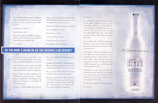
In two other ads that were widely run in about four or five different magazines, Belvedere takes a two page approach to their advertising:


One with the line, "Do you want a drink or do you deserve a Belvedere?" and the other "Who has earned their Na Zdrowie? Who has earned their Belvedere?" the two ads are clever, clean and to the point.


Subjective

Though there were probably some other ads I could have posted, I found the availability of Belvedere ads to be limited. The ones I did find, and have written about are seemingly bland. For me, these ads are the typical liquor ads trying to catch you with their one liners, and creative phrases. Belvedere does try, but not hard enough or suave enough to win me over. The brand seems young still and hopefully their advertisements will grow in strength and potency. Until then Belvedere just remains a bland subject for me.

Ads courtesy of camy.org, visit belvedere's website at www.belvederevodka.com

Tuesday, January 02, 2007

Revival

Having started this blog for a class project, and a mere grade, I set it aside and barely gave it a second thought once the class was completed. Upon reading a marvelous article on blogs in general it got me thinking that this one could continue on. Advertising in the alcohol industry continues to intrigue me and my opinion as well as examples, I feel, should be available for the public's access. That said, look for my continued posting as I will try and get a new post up as soon as tomorrow.

Wednesday, December 07, 2005

A Synopsis

Just to recap a bit, I’d like to reflect on the blogs below. As I have seen through all these different advertising strategies, there are some that work better than others. Personally, I am a big fan of the Corona and Bacardi advertisements; they are original and definitely get the viewers attention. In addition, even though I am a huge fan of Absolult’s advertising campaign, I am not too sure how effective it is these days, or if their ads have just turned into collector’s items. Though they do always incorporate the bottle in every ad, they are more creative then they are promoting the buying and drinking of their alcohol. I also feel the same way about the Heineken ads that I reflected on. Although they are truly unique, I’m not sure how good of a job they do of promoting the beer itself.
Before this blog, I was unfamiliar with Skyy’s advertising strategy. I had asked some friends to try and think of campaigns that they remembered, and Skyy was the first one that they came up with. “Oh yeah, the men always wear suits in those ads,” one of my friends said. This proved to me that different strategies attract different people. I had never taken notice of these ads before yet I was so familiar with Bacardi and Corona. I think I notice more of the islandy, party type of ads. Still, upon seeing these ads I was very impressed by the originality of the campaign. I hadn’t yet seen any company exploit the elegance of drinking quite like Skyy does, and I liked it and think it is very effective. I am also fond of the Bombay Sapphire ads, once being an avid drinker of Bombay and tonics, I noticed their ads a while back. I would question if their print ads mock the style of the Absolut ads, and maybe in that sense also lack the effectiveness. However, I do think their commercials work well for them. They are memorable and very to the point.
The Smirnoff ad campaign I love, I think it is probably the most effective campaign of this whole blog so far. They don’t use distractions and their ads are powerful and eye catching. As for the Jack Daniels and SoCo campaigns, I am not a big fan. I think this is logical though because I think they are targeting a different segment then what I would be attracted to drinking.
All in all, I liked most of the ads and think that the campaigns are successful for the people that they target.

Southern Comfort

Southern Comfort’s ad campaign is similar to that of Jack Daniels, talked about earlier. Nicknamed SoCo, this product promotes a smooth tasting product, and their latest slogan is, “Southern Comfort, between friends.” The commercial that is currently on TV is most obviously geared towards the upcoming holidays and is creative. The setting is someone’s house where a group of friends are sitting around, it looks something like a Yankee swap. People are opening absurd presents, useless things, and trying hard not to look upset. Then you see this one guy open his present and start glowing, the camera shows it to be a bottle of Southern Comfort, he looks around and everyone is staring at him. Suddenly, they all pounce towards his grabbing for the SoCo. This commercial is effective because it really emphasizes the slogan, and you get a sense of SoCo bringing together friends. It seems like perfect drink for just relaxing and hanging out.
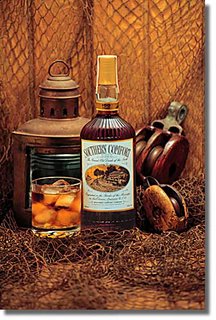
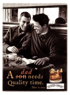
Below is a couple of their print ads. The first closely mirrors those seen from Jack Daniels. It has the bottle centered and a glass with ice full of it, then a kind of rustic background. It reminds me of a farm kind of place. This is effective because the ad feels homey, that after a long day of work, or even a rainy day of doing nothing, you can always sit back and relax with a glass of SoCo. The other ad is a picture of a father and son bonding at a restaurant both with glasses of SoCo in front of them, it reads, “A dad needs quality time.” It can clearly be noted it did say son, but that got crossed out and dad was written above it. This ad is touching because it depicts an emotional exchange that a father and son are having. They both look like they are enjoying themselves. The significance of the caption is also heartfelt. Growing up sons often want to spend tons of time with their fathers, but as they get older they often don’t get to spend that time together. This ad kind of reassures fathers that with SoCo the two can find that moment to hang out and bond.
I think all of SoCo’s ads are comforting, no pun intended, and are successful at marketing their product.

Stolichnaya

Stolichnaya Vodka is a very popular brand among the vodka sector. Nicknamed Stoli for short, it is a brand that has many loyal consumers. In fact, Stoli is so well known and recognized that rather than work on advertising their signature product, there straight up plain vodka, they have now moved to advertising their flavored vodkas. Unpopular at first, flavored vodkas have come on to the scene strong, now seen as an enhancement to many mixed drinks. Stoli’s take on their advertising campaign was promoting the superb taste and quality of vodka when it is chilled properly. Below is their classic ad for their plain vodka. The ad is simple and yet stunning. It shows a room completely frosted over, with just the bottle sitting on the end table. The room looks as though it is in someone’s house. This ad is unique because the bottle is not in the center of the page, nor is it in the left to right diagonal where our eyes naturally go. However, this works for the ad because there are no other distractions to catch the eye, it’s just pure white. I think that is another point, the purity of white exemplifies the pure, crispness of the vodka itself.


Going back to the idea of flavored vodkas, below are two ads, one for their raspberry vodka, and the other for their peach vodka. Both ads differ from the first ad in that the bottle is centered. In addition, rather than the background looking like a room of a house, now both ads’ background looks like a bar. This is peculiar and perhaps signifies that these flavored vodkas are unique in the way that they are what restaurants are serving, not just what your friends have at home. Another unique thing is how next to both bottles are the fruit that corresponds with the flavoring of the vodka. I think this is a great technique because not only does the bottle stand out, but incase you were not paying attention or did not want to strain your eyes, you can clearly pick up on what flavor the vodka is. I think these ads are very effective, and even more, they are eye catching and would probably stop somebody who is just flipping through a magazine.

Tuesday, December 06, 2005

Jack Daniels

Jack Daniels advertising is unlike any other discussed so far. Being a whiskey, the target market for Jack Daniels is completely different then for something such as vodka or rum. They are targeting an older crowd. The only similarity is that Jack is best drank straight up, or so promoted. Rather than advertise about partying, or even sophistication, Jack Daniels focuses its ads on the quality and history of its product. It was produced in the 1860s and has been a leader in the whiskey sector ever since. In the earlier days it was most likely drank straight up, but now with people drinking more in a sitting Jack and Coke has become a popular drink.
The two advertisements below are simple and to the point. Again, taking the strategy of having only the product in the picture, the ads are focused and give a clear message: something that has been around for so long can not be wrong. Both ads show the bottle and it straight up in a glass next to it. The first reads, “The same since the Sixties” in large print and, “That would be the 1860s” in small print reinforcing the message that it has been around for a very long time. The second ad says, “Not subject to change” in large print and, “Not now. Not ever.” in small print. This too shows how it is a consistent product that their loyal drinkers can count on. Its popularity is not to go unnoticed.


These ads are effectively because they give a very clear message, and there is nothing to distract the observer. They are concise and do the job of promoting the product in the sense that how could anyone want to choose any other whiskey when it is so clear that this whiskey has been the choice for over one hundred years.

Skyy

Skyy Vodka is a swank product, drank by only the best—or so their ads portray. Skyy’s ads tastefully incorporate their product with their target market. The men are always wearing expensive suits while the women are beautifully and scantily clad. The image that Skyy gives is one of wealth, cleanliness, and class. Below are a couple ads exemplifying this image. The first one shows a man in a suit standing over a woman in a bathing suit with martini glasses and Skyy. They are obviously on a beach on what looks like the perfect day. Any businessman would want to be in that situation. The second ad pictures a man and woman on a red couch, red being a color for power, with money scattered about them. The man has a martini in his hand, while the woman’s martini sits on the table the front of the ad next to the Skyy bottle. They both are dressed up as if coming back from some important event. Both ads show that this vodka is not for just anyone; in fact it is probably not for most people, but rather the elite. The ads scream high class, in this way people who yearn to look swank would feel that this vodka would be the choice to pick. Showing up to a gathering with Skyy vodka means that the consumer is chic and is ready for a sophisticated night.


Another thing that Skyy has going for them is their distinct bottle. The blue coloring of it makes it stand out from the rest, and walking into a liquor store a consumer could quickly seek it out. Also, the gold coloring of the label goes well with the blue and makes for an elegant looking ensemble. Skyy has one of those bottles that even when the consumer is finished drinking it, they might want to keep the empty bottle because of its looks.

Captain Morgan

Captain Morgan is another company that has rather eye catching unique advertising. Their ads focus on the fun, party aspect of alcohol. Instead of promoting the classy, clean aspect of the rum much like Bacardi, the setting for all their ads is a fun atmosphere and their mascot, The Captain, is always there. Their slogan is “the Captain was here” and they incorporate that by drawing the captains mustache and goatee on one of the persons in the ad, as seen in the ad below. One ad was even a young guy, clearly passed out on a couch with the mustache and goatee drawn on his face. That exemplifies the underlying unsaid message that Captain Morgan does not really enforce drinking responsibly, such as the ad, if someone drinks too much, they’ll just pass out.


Their ads are effective because they have their product in settings that are attractive to their target market. The audience they target is often younger adults in their 20s to 30s. Most recently, they have moved away from this target market and moved towards targeting the general working public. Their latest commercial has people in everyday jobs such as a dentist, a lawyer, etc. and when the camera focuses on them they put one knee up, the commercial ends with, “They had a little Captain in them.” The everyday consumer who doesn’t know about Captain Morgan gets the commercial at the end when they should a picture of the Captain, as seen below, with his leg up on the keg. However, commercials are not really Captain Morgan’s main advertising outlet. Rather, the majority of their ads are print ads in a variety of magazines.
Captain Morgan’s rum is most focused on their consumers who are already drinking their alcohol. I believe that through their ads, rather than try and solely gain new customers, they target their drinkers to help them gain consumers by word of mouth and promotion.

Heineken

“It’s all about the beer.” This is Heineken’s simple slogan. I see Heineken as being very similar to Corona in the way that they are exclusive, not for every average beer drinker. Also, Heineken does not advertise as much as other beer companies, therefore their ads have to be effective. The question is does their ads do that? Humor in commercials is always very appealing to me, and Heineken incorporates just that, well played humor. Their two most unforgettable ads have to do with the past. The first one is entitled “The Birth of Lighters at Concerts” and be found at:
http://www.advertisementave.com/tv/ad.asp?u_player=realplayer&adid=174
It shows a band playing at a large concert, they have just ended a song and it shows a man putting his Heineken down in order to clap, once he’s done clapping he leans down to find his Heineken and uses his lighter so he can see better. Someone sees it doing and copies him, raising it above their head and waving it around. By the time he stands up, everyone around him is doing it, he looks confused but satisfied because he’s found his beer. The commercial connects Heineken to a well known tradition, and in this way builds the image of their beer to be a trend setting product.
The other commercial is called “The Birth of the Peace Symbol” it incorporates a similar message as the one explained above, and can be found at:
http://www.advertisementave.com/tv/ad.asp?adid=175
It shows a guy at Woodstock asking for two Heinekens, the other person can not really hear him so he puts up two fingers like a peace sign, and says “Two Heinekens please.” Another person walks up to him mimicking the sign, and asks him what it means, he starts to explain “Two Heinekens…” then says, “Peace!” The guy is amazed and loves the new sign, he goes around and does it to some people who mimic him, eventually everyone there is doing it. Again, this ties Heineken to a traditional symbol, showing its power.
The ads are effective because they are funny and memorable, and since the actions are tied to Heineken the commercials don’t lose sight of the product.

Baileys

Baileys is another company that has recently come out with a memorable ad campaign. In their ads they stress a relaxed, social environment. Everyone is having a good time, and of course drinking Baileys. They also stress how Baileys can help with social interaction. For example, in their latest commercial the setting is a gathering a bartender is pouring Baileys and then catches the eye of a woman relaxing next to the bar, she sees that a drop of Baileys is about to fall from the bottle and raises her eyebrow—Sense of Play comes on the screen. As the drop falls from the bottle, about to fall in the woman’s mouth another man sitting next to her puts his glass above her and catches the drop in his glass—Sense of Timing comes on the screen. The three laugh. It’s a creative take on the product, and focuses on the drinking environment in which their product is appropriate. Although the product is always in sight, it is in the glass and the bottle is only shown a couple times. This could be improved so that people are sure to remember what product is being advertised. Still, here I am, a non-Baileys drinking and I remembered the ad and what it was for, hence it is somewhat effective.
Baileys sets itself apart from other alcohol commercials, much like Corona, because it uses a non-stereotypical setting. Instead of a rowdy, crazy party like some commercials, theirs is calm, more like hanging out with friends. The message there is that it is a mature product. Not something for college grads, but rather a drink for a sophisticated palate. Another thing that the Baileys ad campaign stresses is drinking their product alone. It does not need anything added to it, it is just perfect by itself. This is a lot like Smirnoffs ads explained earlier.

Corona

Another personal favorite is Corona. The commercials they use are unlike any other beer commercials. They do not use sports in their ads such as football like oh so many beer companies do. Instead, they market their product in a different way. Their message: Coronas aren’t something you bring to the Monday Night Football game, they’re swank, relaxing, and should be drank at the most perfect moment. Their commercials incorporate the product with a serene island, usually uninhabited with only the people who are drinking their product there. Even then you do not see their faces, instead only from about the chest down because the camera centers on the product. My favorite commercials has to be the one where a man and a woman are drinking Corona and the woman takes the return flight plane tickets, rips them both in half, and puts each half under their beers like coasters. How could somebody not see that and go “I wish I was there doing that!” and I think that’s what they’re trying to get at. Drink their product and it will be like being in paradise. What a provocative message for just a beer, and it works. Growing up near the coast, whenever everybody would get together to go to the beach someone would always be in charge of bringing the Corona. We grouped the serenity and relaxation of the beach with Corona, just like the commercial. A pictorial clip of one of their commercials is below. It depicts a woman holding up an empty Corona to her ear, it is supposed to be a mock conch shell, it is unique and original and portrays Coronas image well.


Another thing that works for Corona is their connection with the Cinco de Mayo. It’s universally known that when Cinco de Mayo comes around bars need to stock up on Coronas. How they accomplished this I don’t know, but being a Mexican beer, it works. Indeed, because of their creative advertisements and their near monopoly on Cinco de Mayo I think Corona is one of the best marketers out there.

Friday, December 02, 2005

Smirnoff

Smirnoff Vodka is another company with captivating commercials. Unlike Bacardi, Smirnoff does not use humor in their ads, but rather uses their commercials to deliver a blunt and effective message about their product. Now before I go into detail about why I like this certain ad campaign, let me clear something up. These various companies that I have talked about, namely Bacardi and now Smirnoff both have a line of coolers but this blog will focus on their signature, straight up product, for instance for Bacardi it was Bacardi Superior, and now for Smirnoff I will be focusing on their ad campaign for Smirnoff Triple Distilled. I take this focus because not being a drinker of coolers I am at a disadvantage for relating to their target market, and therefore the ads have less appeal to me.
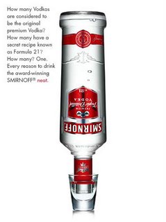
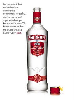
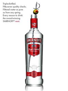
Smirnoff’s Triple Distilled ad campaign is sharp and completely focused on the product. To reinforce this focus the background is set at a solid white, allowing the viewer no distractions. The main message of their commercials is how enjoyable the vodka is just by itself—neat. There are four commercials in this new series where they pitch how to drink the vodka “neat”. The first is just in a shot glass, the next is with a lemon twist, the final two, as a martini—showing an olive, and then a shaker. The print versions of the commercials can be seen below, however to view the commercials all you have to do is go onto the Smirnoff website at http://us.smirnoff.com/ The commercials are creative and keep the viewers attention. Also because there are no other items involved in the message such as people the product is more likely to stick in the viewer’s memory. Also, Smirnoff emphasizes drinking responsibly, which is stated at the end of every one of their ads. They even focused a whole commercial on the efforts one should make to get a designated driver before going out, which is a subject rarely touched by other alcohol companies. Again, as with their other commercials this one about the designated driver is set on a white background and shows only a set of keys, giving the message that is a serious issue.
I think what draws me most to this ad campaign, much like the other ones I have discussed, is the simplicity of it. They don’t show the social benefits or anything like that, just the product, crisp and clean, and I like that. I think this ad campaign is definitely going to prove to be profitable for Smirnoff.